WEEK 14
FINALISATION + VIVA PREP
Finalising the system and preparing for viva
This week focused on consolidating the project into a final, presentable state. The aim was no longer to add new features, but to stabilise the existing system, produce visual identity elements, and plan how the full setup would be experienced during viva. It became a week of alignment: making sure the website, collaterals, animation, and physical setup could read as one coherent project.
Final system configuration
Ensuring the website is stable, complete, and ready to be experienced as a full tool from capture to export.
Visual identity and presentation assets
Developing the logo animation and physical identity elements so the project feels more resolved as a system.
Preparing final setup for viva
Planning, testing, and assembling the final environment so the digital tool and physical outputs work together.
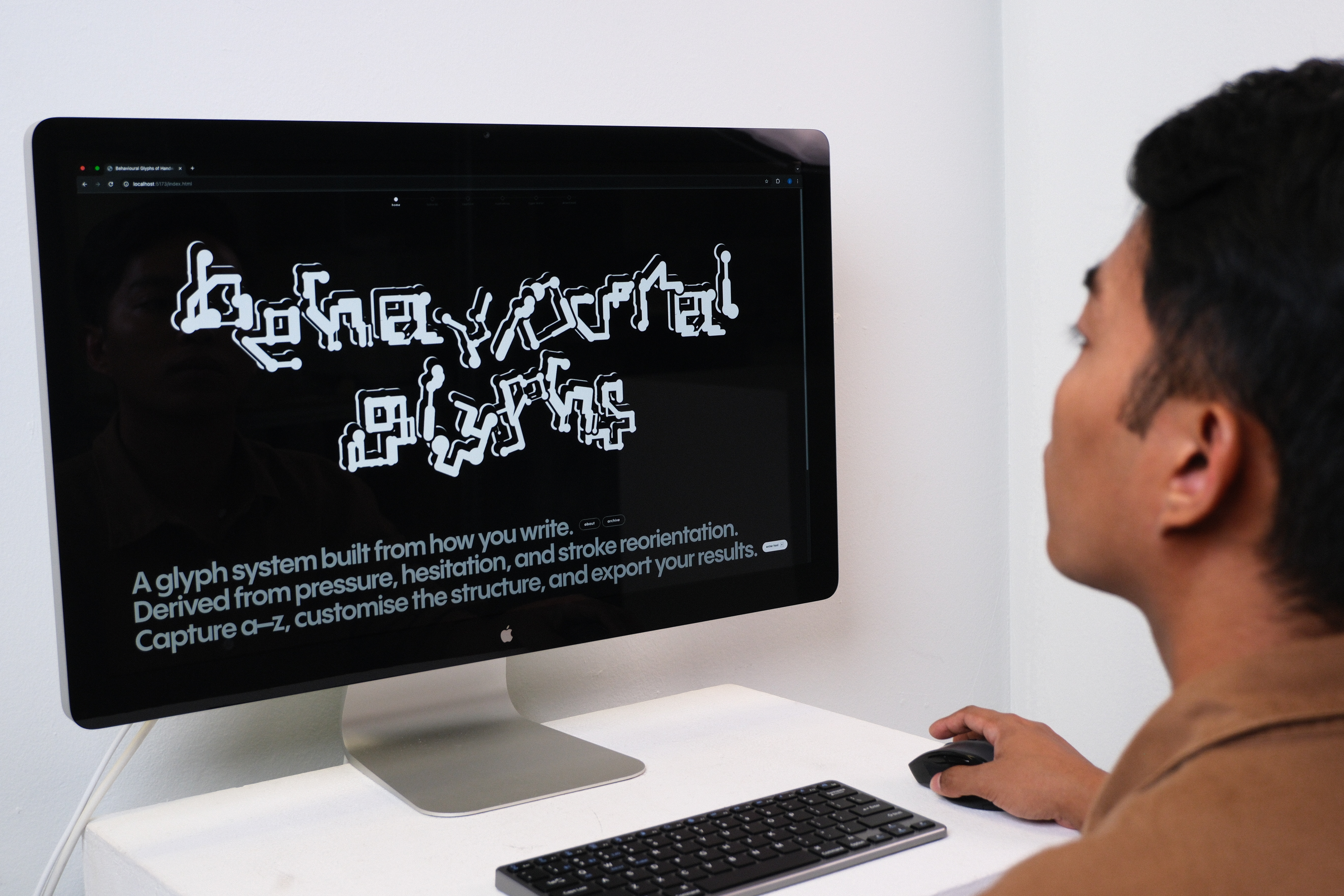
[ Final website configured ]
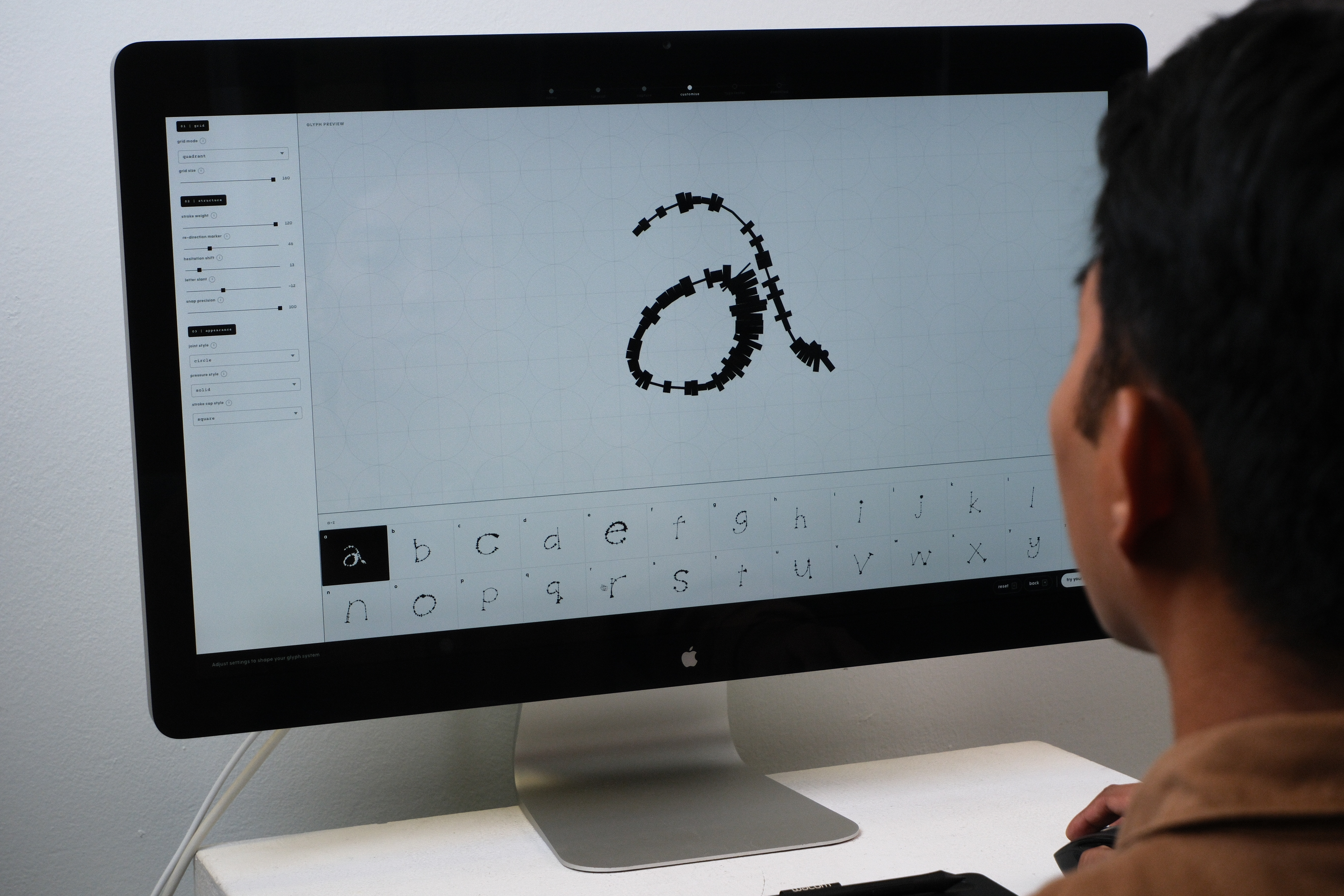
System stability
Preparing the tool as a complete user flow
By this stage, the website was fully configured and ready for use. All core pages were working together as one continuous flow: capture, customisation, type testing, and download. Instead of treating these pages as separate screens, I needed them to behave as connected stages within the same behavioural glyph system.
What changed this week was not the addition of new features, but the stabilisation of what already existed. I checked whether the tool could be demonstrated clearly, whether the flow made sense without too much explanation, and whether the output process felt complete. This was important because the viva setup depends on the system being reliable. If the website breaks, the rest of the project becomes harder to understand.
This step helped me see the website less as a prototype and more as the central structure that holds the project together. The collaterals, zines, stamps, and workshop outcomes all depend on the tool producing a coherent glyph system first.
[ Logo animation ]
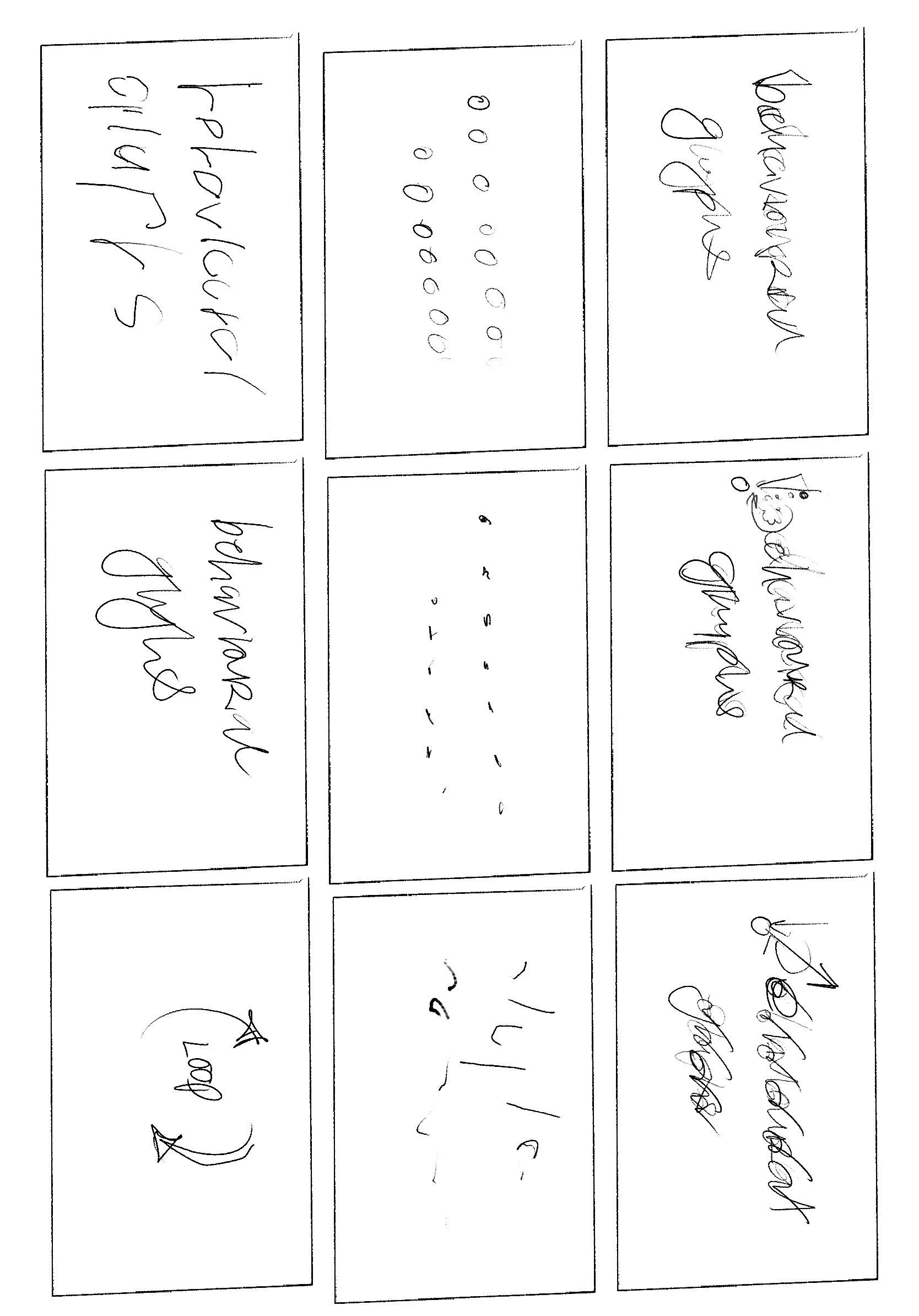
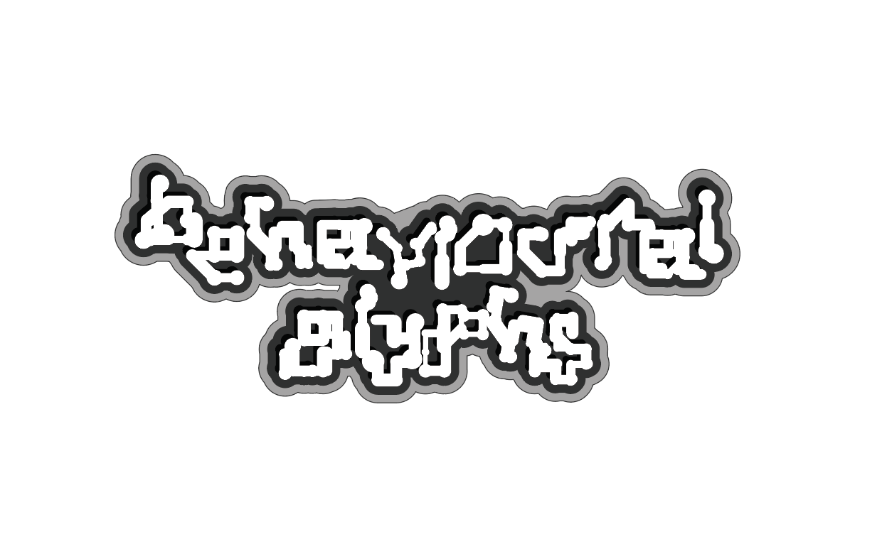
Visual identity in motion
Compressing the system logic into animation
I explored how the identity of the project could be expressed through motion. Rather than making the logo animation decorative, I wanted it to echo the logic of the system: handwriting enters, behaviour is detected, and form is reconstructed through rules.
The storyboard helped me think through this as a sequence. The animation needed to feel like a small version of the whole project, where motion becomes structure. I kept the visual language simple so that the transformation could remain clear. This made the animation function less like branding and more like a compressed explanation of the system.
This also helped tie the project identity back to the tool. The logo is not just a name placed on top of the project. It becomes another output that follows the same logic of transformation, reconstruction, and behavioural interpretation.
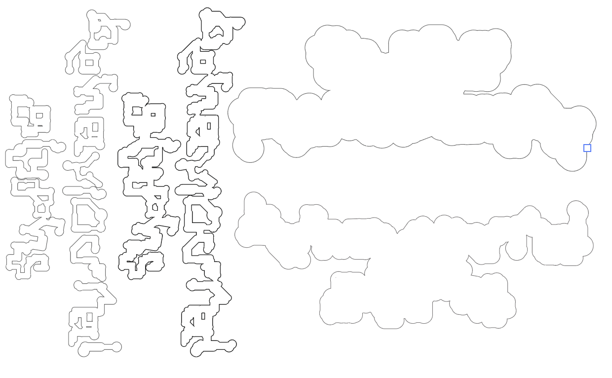
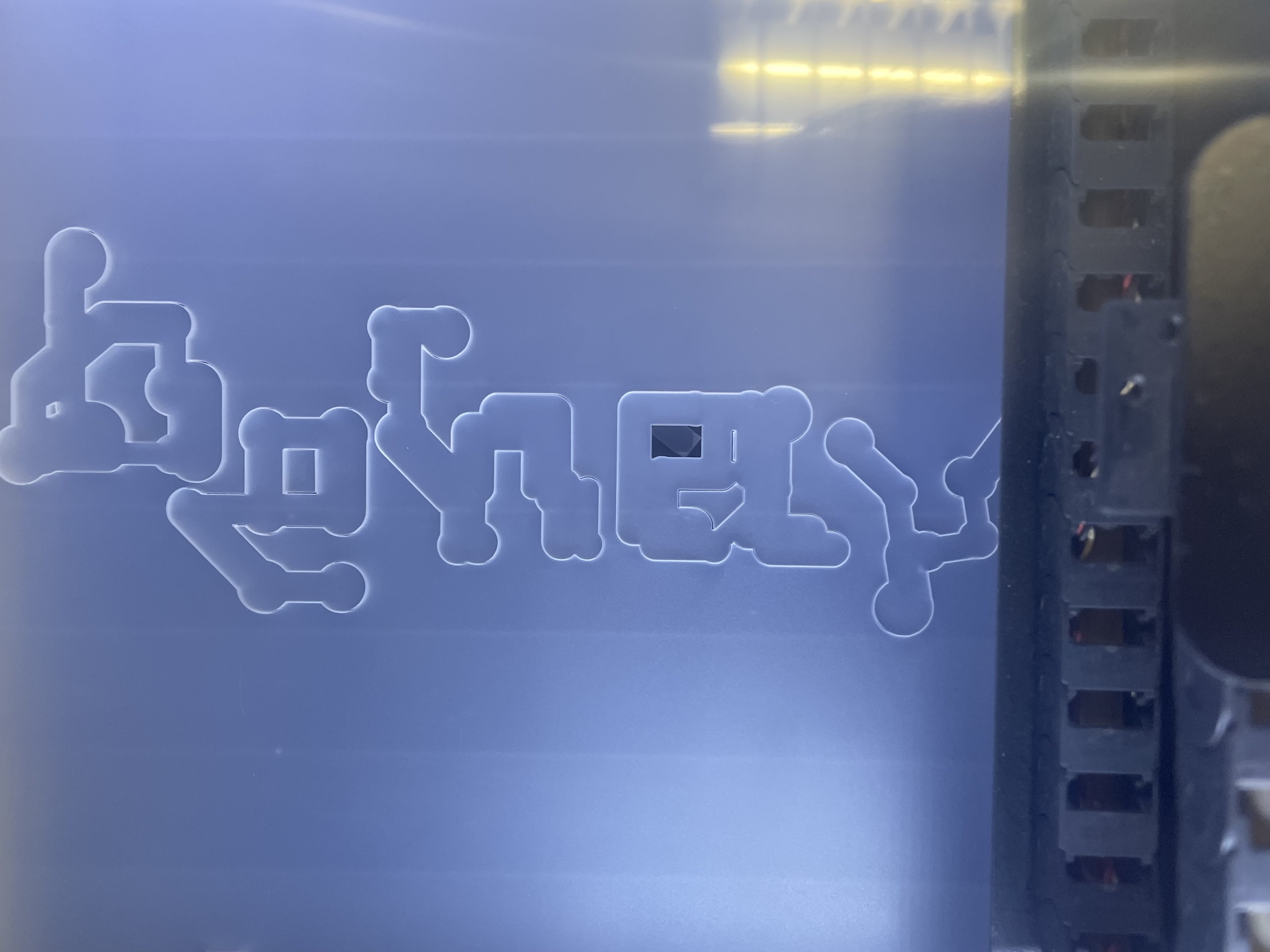
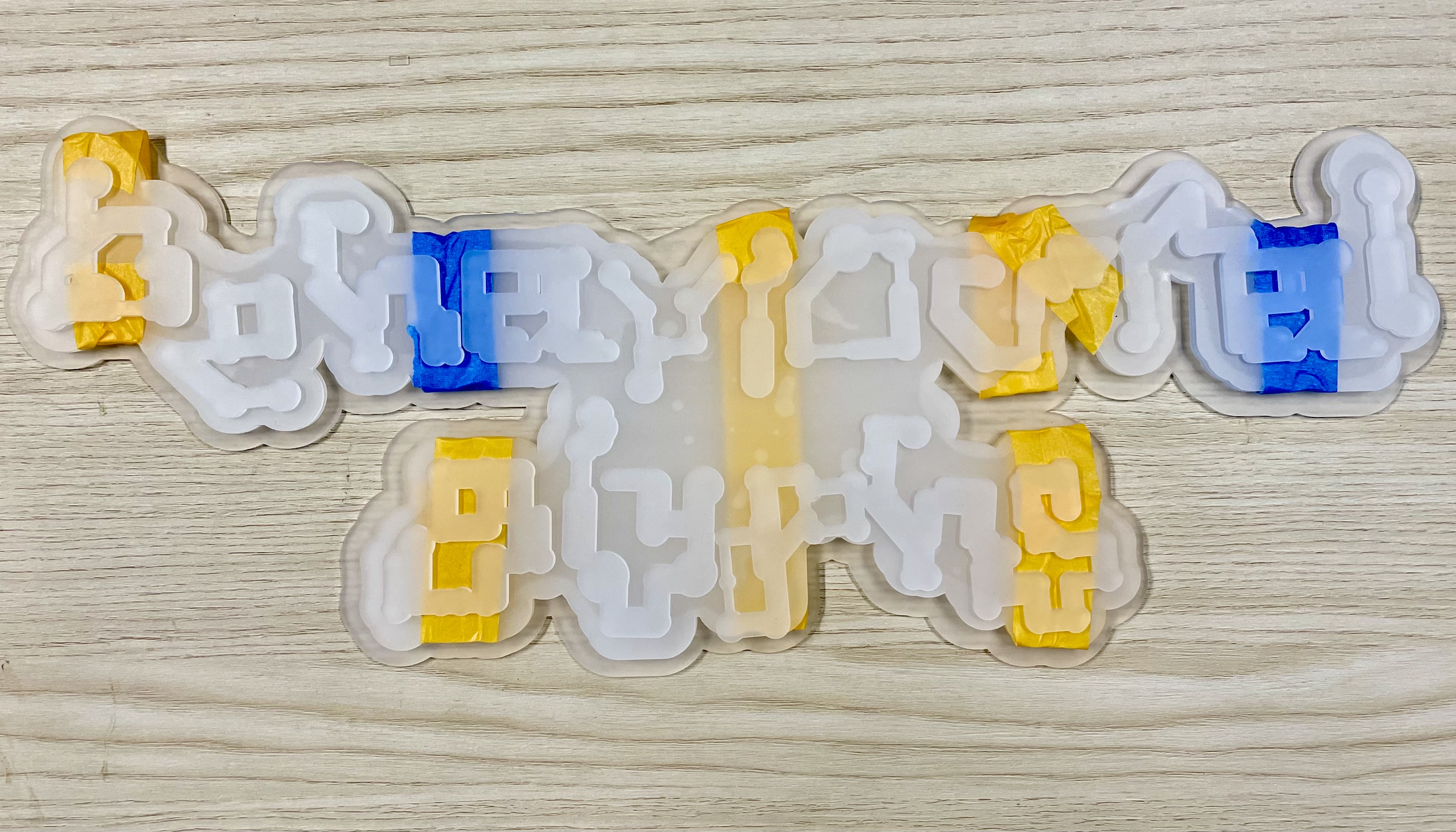
[ Logo laser cut ]
From screen to object
Making the project identity physical
I translated the logo into a physical form through laser cutting. This moved the identity from a screen-based graphic into something that could exist as part of the viva setup.
The process required more than simply sending the logo to cut. I had to plan the form, prepare the vector file, test how it would sit in the setup, laser cut it, and then apply it physically. Each step forced me to consider scale, legibility, surface, and placement.
- Planning the form
Checking how the logo should appear within the final setup. - Preparing the vector file
Cleaning the file so it could be cut accurately. - Laser cutting
Translating the digital outline into a physical object. - Applying the final piece
Installing the logo so it became part of the presentation environment.
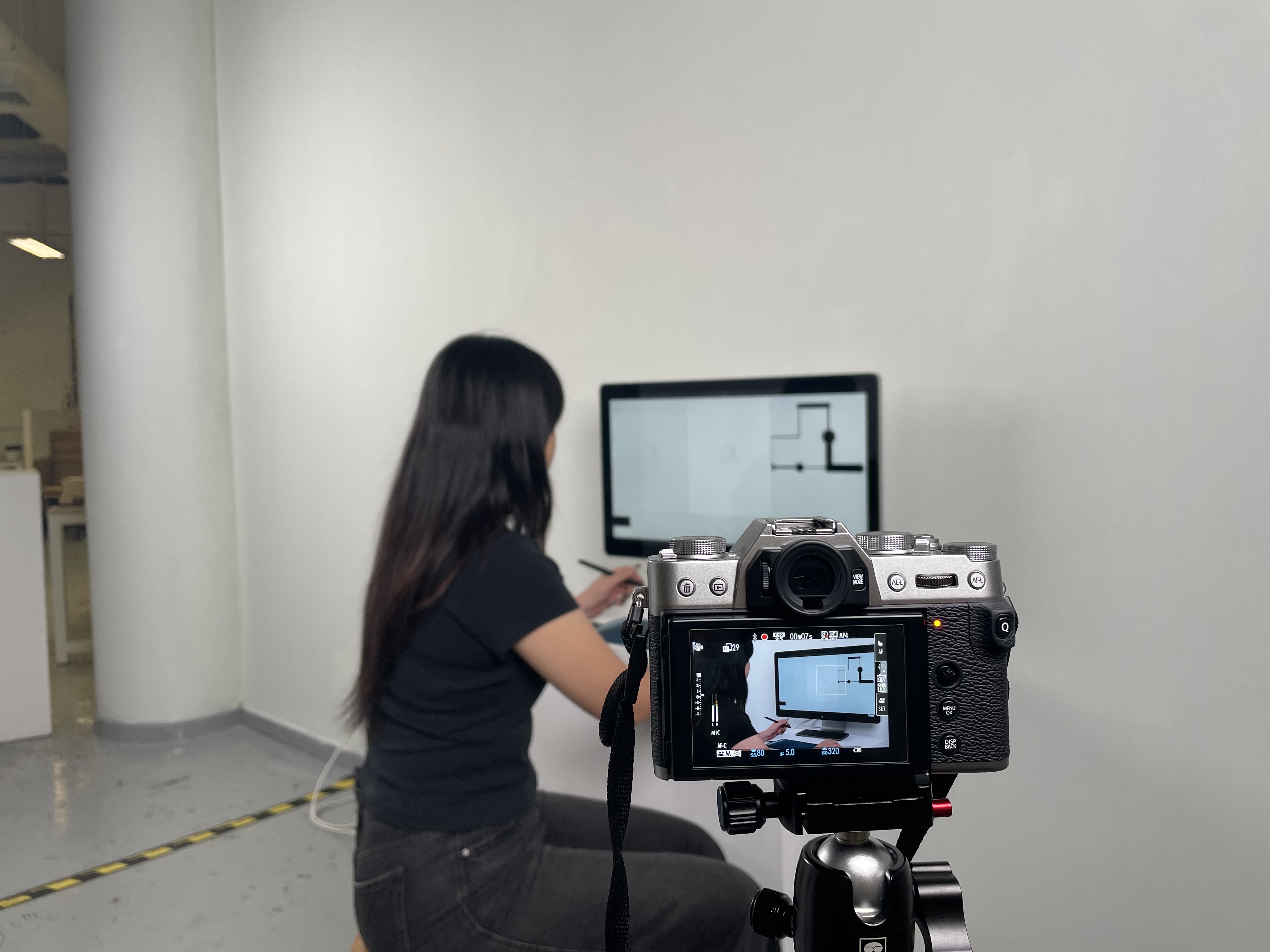
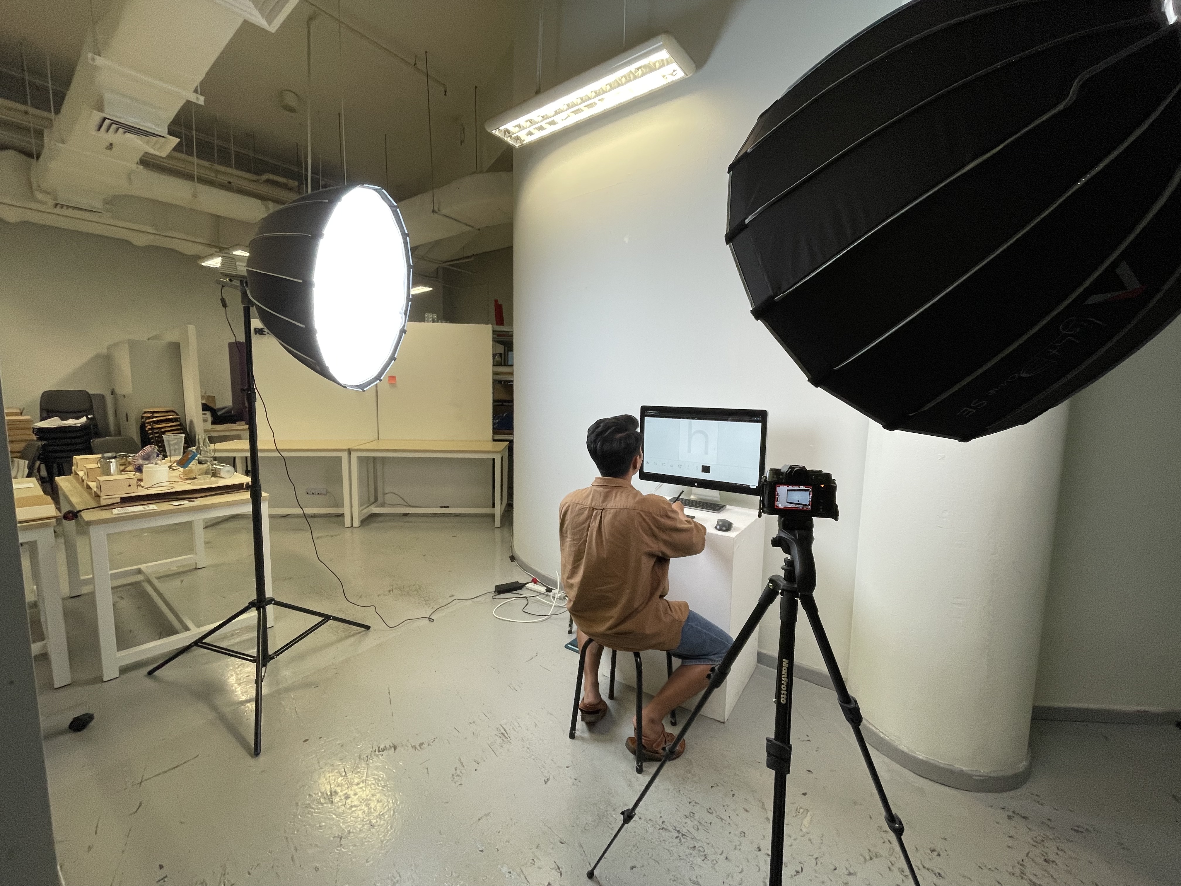
[ Filming viva video ]
Documentation as communication
Recording the project clearly enough to be understood
I recorded the viva presentation video this week, and the process took several attempts. The first recording was unusable because of technical issues, so I had to redo it. Although this was frustrating, it made me realise that documentation is not separate from the project.
The viva video had to show not only what the tool looks like, but how the system moves from handwriting behaviour to reconstructed glyph output. This forced me to think about pacing and explanation. I had to decide what needed to be shown first, what could be explained quickly, and where the viewer might need more visual evidence. In that sense, the video became another form of system design.
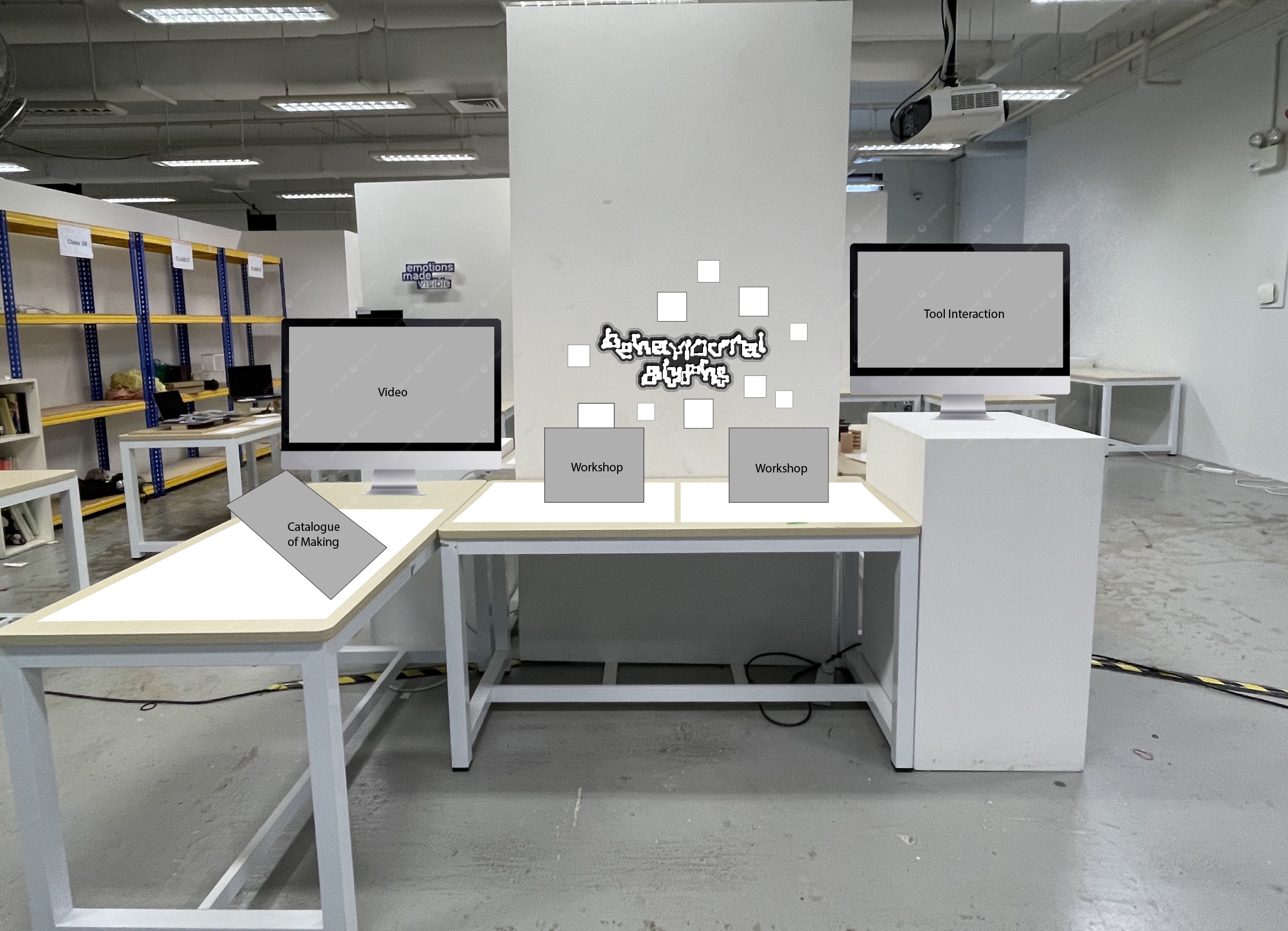
[ Planning viva setup ]
Spatial arrangement
Testing how the project would be read as a setup
Before assembling the final setup, I created a low-fidelity mockup to test how everything would be arranged. This helped me think through spacing, hierarchy, and how the different components would be read together.
At this point, the project had many parts: the website, stamp station, alphabet zines, workshop archive, printed collaterals, and visual identity elements. The challenge was not just placing them on a table, but making sure they could be understood as one connected system.
The mockup helped me plan the order of encounter. Visitors should be able to understand the project through movement: first seeing the identity of the project, then interacting with the website, then moving towards the physical outputs. This made the setup feel more intentional and less like a display of separate items.
[ Next step ]
Complete remaining prints
Finish Booklet 3 and 4 so the full catalogue is ready for final presentation.
[ Next step ]
Refine presentation delivery
Ensure the viva explanation clearly communicates the system logic, making process, and final outcomes.
[ Next step ]
Prepare for final review
Test the full setup again, check the website flow, and make final adjustments before presentation.